SLxfig Plotting Examples
| SLxfig |
| Examples |
| Download |
| jed |
| S-Lang |
| most |
| Complex Domain Coloring |
| SLxfig |
| Antennas |
| Thermochron |
| jedsoft.org |
On this page, you will find examples of some plots and drawings that were created using the SLxfig module. Click on a figure below to see the code that generated it.
A group at the Dr. Karl Remeis observatory of the University of Erlangen-Nuremberg has also compiled a very nice set of SLxfig examples.
| This is a simple plot of a damped exponential. | 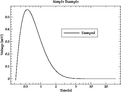 |
| This plot illustrates the use of color. Note the ``small-caps'' font used in the caption. | 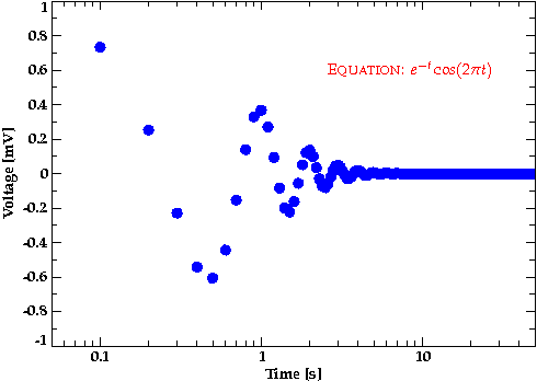 |
| A shaded histogram. | 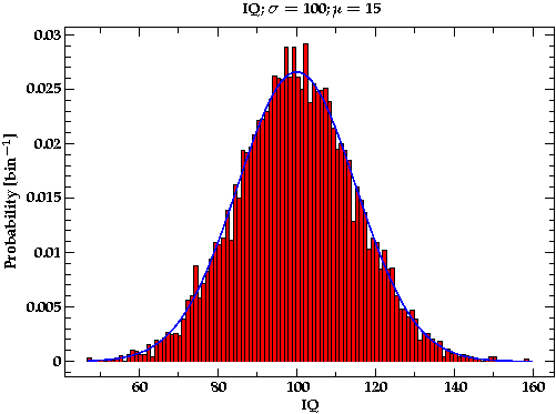 |
| Here are two stacked plots sharing a common X axis. | 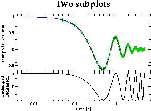 |
| This plot contains both X and Y errorbars | 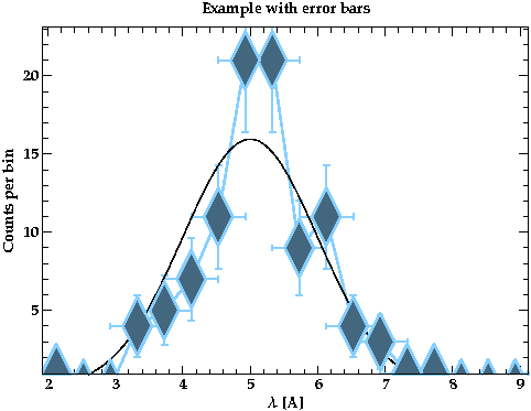 |
| This image plot uses S-Lang's drywet colormap. | 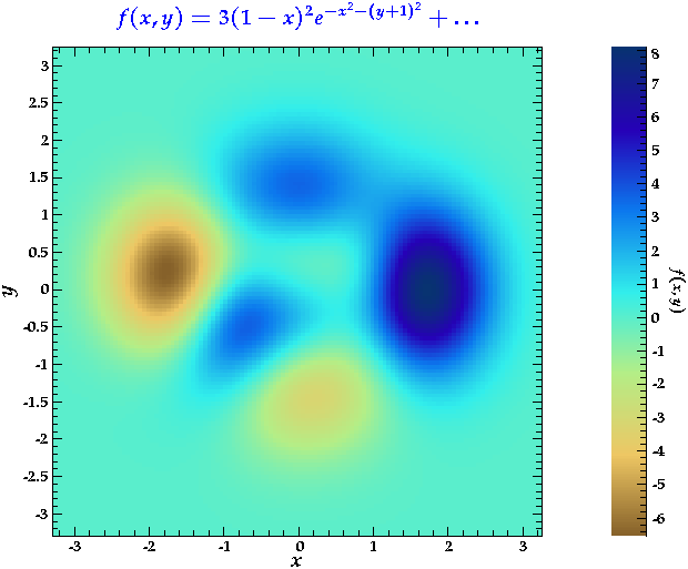 |
| This plot shows the ratios of the speed of the python Numeric and numarray extensions to speed of S-Lang as a function of array size. As the plot shows, S-Lang is about 10 times faster than numarray is for small arrays, and almost twice as fast for large arrays. It also shows the well-known fact that numarray is worse than Numeric for small arrays. The dramatic decrease in speed of numarray for arrays larger than 10000 elements may be due to cache misses. | 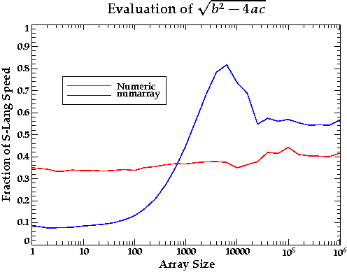 |
| This so-called order-sorting plot shows an image of a binned Chandra level 1.5 event list. The X axis corresponds to the Chandra MEG grating wavelength and the Y axis corresponds to an effective grating order given as the product of the grating wavelength and the ACIS CCD energy. Such a plot is extremely useful for diagnosing problems with the order-sorting process as well as the gain calibration of the CCDs. | 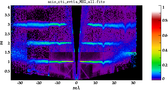 |
| I created this figure to illustrate the features that one might see in an order-sorting plot. | 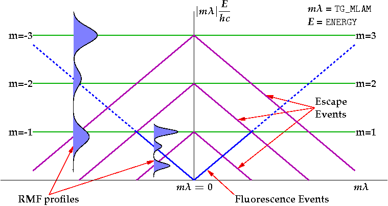 |
| Plots of this type were created for a paper on the Con-X off-plane gratings. This example provides a simple illustration of the vbox/hbox statcking functions. | 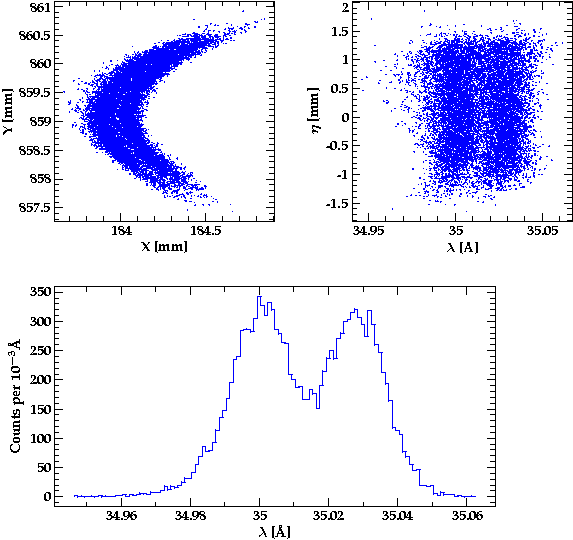 |
| This figure was created to graphically illustrate the meaning of some of the maplib module's projections. Did I mention that SLxfig can do 3-d projections? | 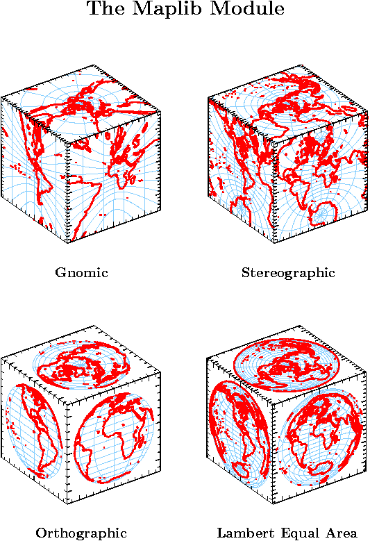 |
| The bottom plot shows, among other things, the effect of a proposed sub-pixel algorithm for ACIS data. | 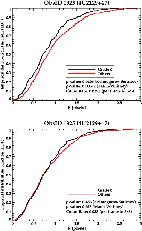 |